Level Up Onboarding by Enhancing Info Hierarchy of Home Screen
Delitoon

As-Is
High Drop-Off Rate in Onboarding: Overwhelming Promotions on Main Screen
The banner replaces navigation bar, repeating similar content
giving an impression of limited updates and lack of contents
Promotional banners occupy 2/3 of the main screen
causing visibility issues for actual content
Users must move the segments to find key content
making the experience less intuitive


[Voir Plus (see more)] button appears accordion-like, but redirects to weekly updates
Mes Lectures (my readings) section is located too low
making access difficult

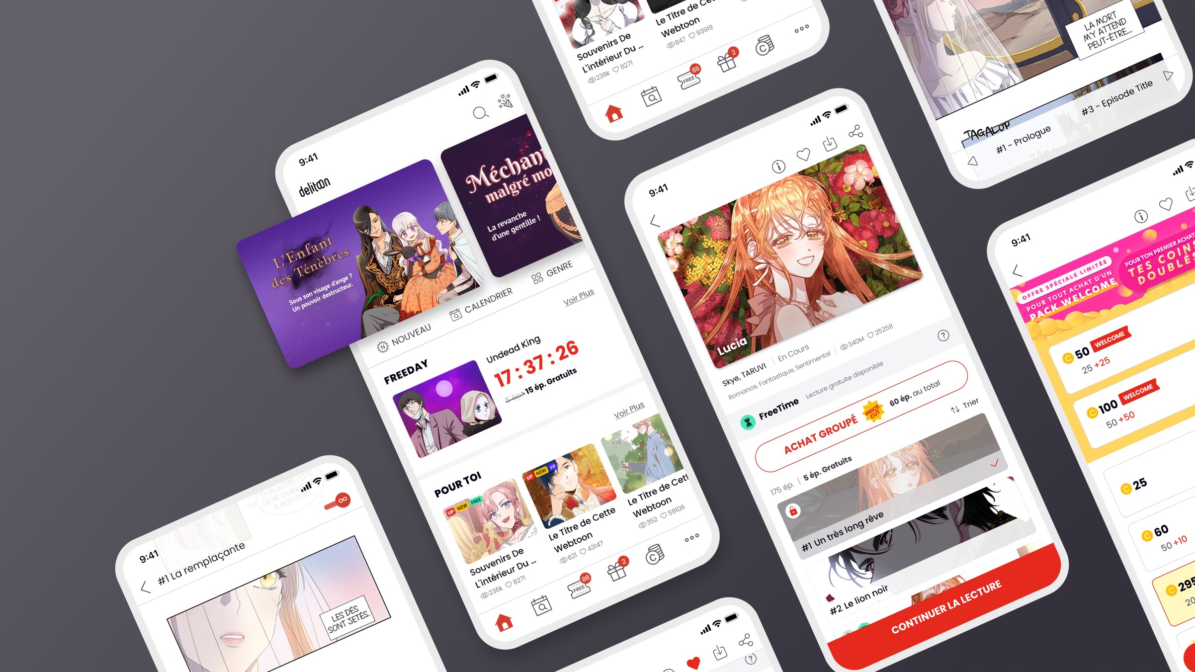
Reframing the Information Hierarchy
Minimizing User Drop-off on the Main Screen
Core Value Repositioning: Webcomics Are Also Products
Content-Sales Platform
If massive discounts aren’t possible because our products are not the mass produced in a factory, the products(contents) must look appealing at first glance
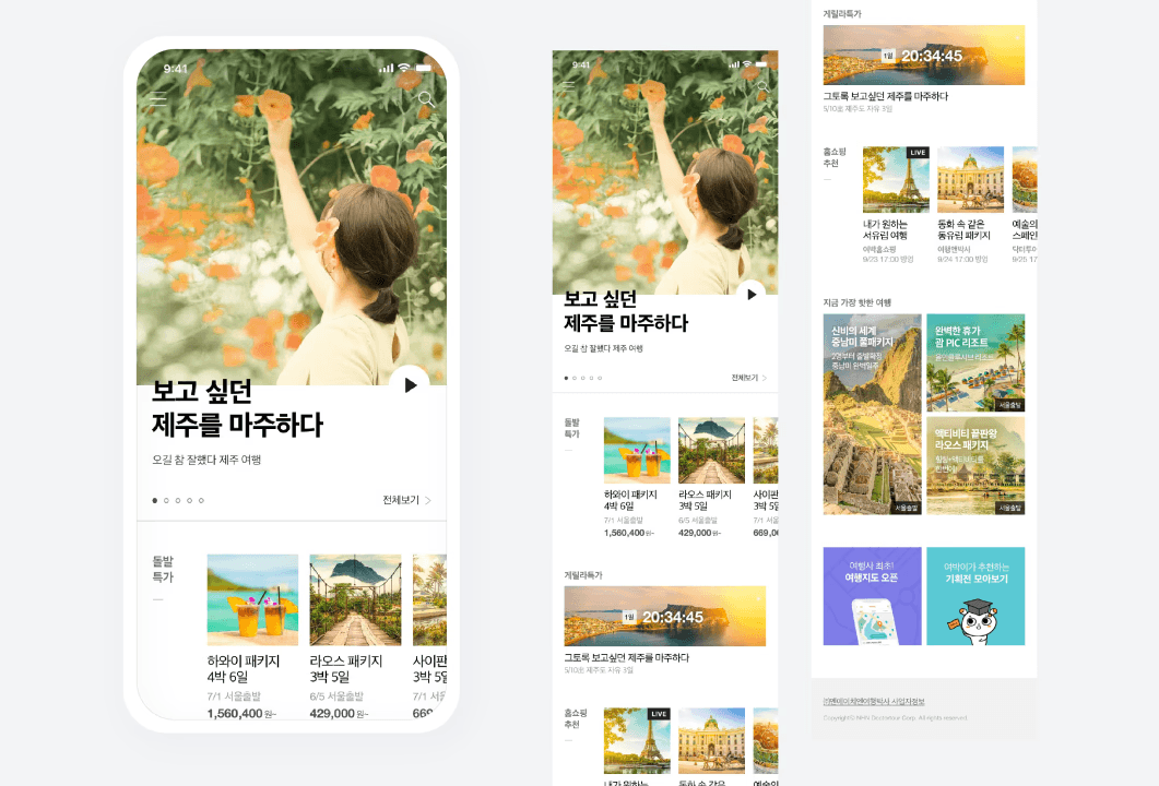
Benchmark commercial platforms to focus on "sales"


Reconstructing wireframes with re-prioritized content hierarchy


Solution 1
Avoid User Fatigue from Repetitive Banners

Iteration
To-Be

Solution 2
Enhance Personal Curation

Iteration
To-Be

Final Prototype

Result & Impact
20%
Onboarding Drop-off Decrease after update (2020-2021)
1.83M
Registered Users Grow (2020-2021), from 1M
~25,000
Weekly Active Users Increased (Q4 2020)
40.2%
Revenue Increase (2020-2021), €3.6M