Increase in Checkout Conversion Rates by Adding Pricing Info in the Calendar
Tourbaksa

As-Is
High Drop-off at the Transition from Product Detail Page to Checkout
Users frequently complained about difficulties checking exact dates and pricing
Users often had to call directly to check availability
increasing customer service costs
Many cancellations that could not be converted into numbers were assumed
from the confusion of the users while checking the schedule as the users will just leave
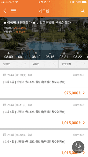
Narrow vertical layout required horizontal scrolling to view different dates
No clear pricing by date
users had to click each day individually to find the lowest price
Only the dates available for reservation are displayed, not every day
causing confusion and errors

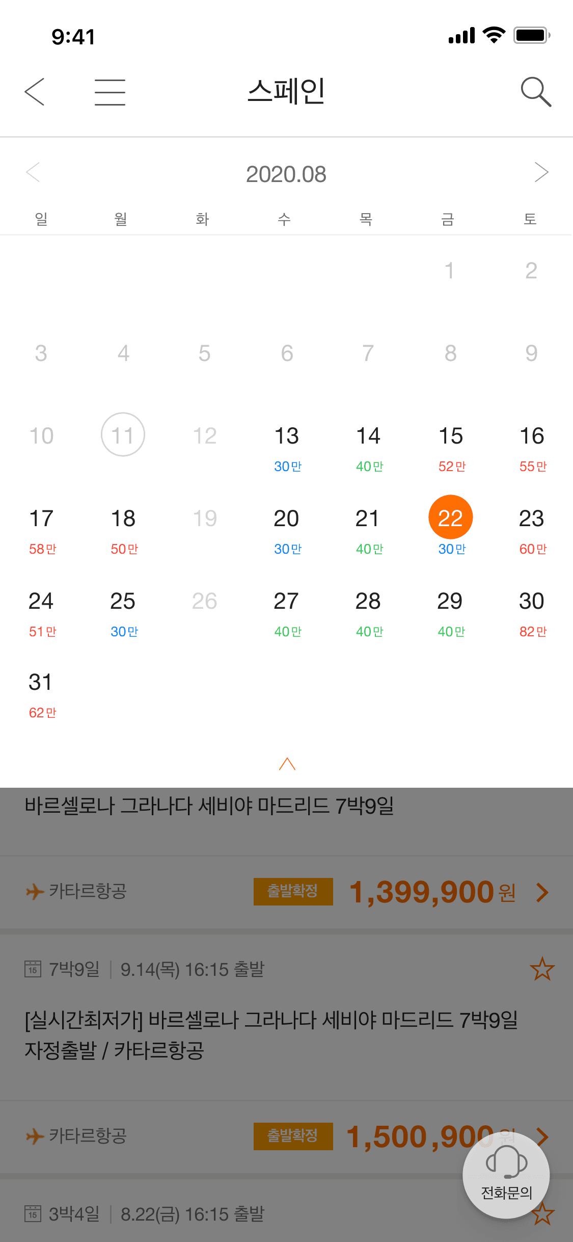
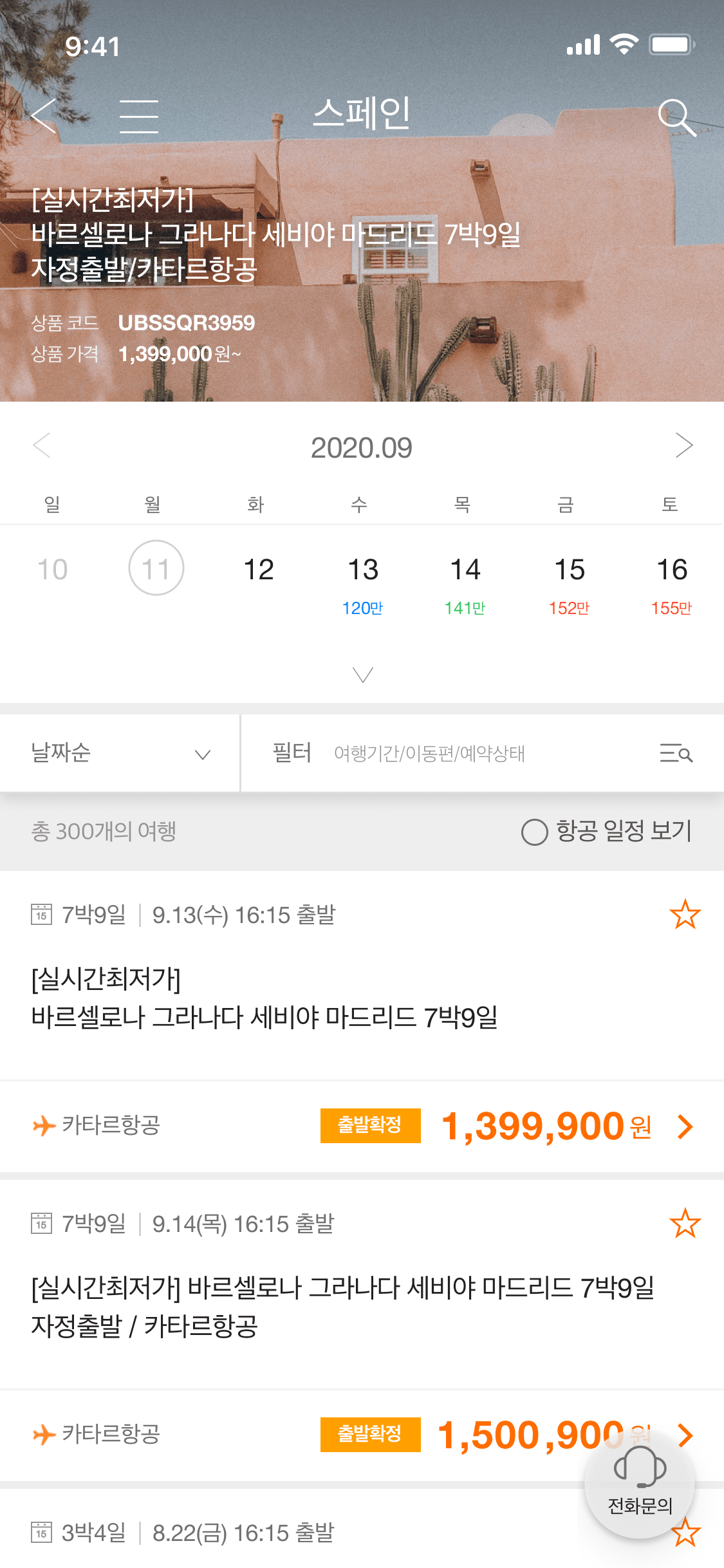
Improving Calendar Usability

To-Be
Design Overhaul
Weekly
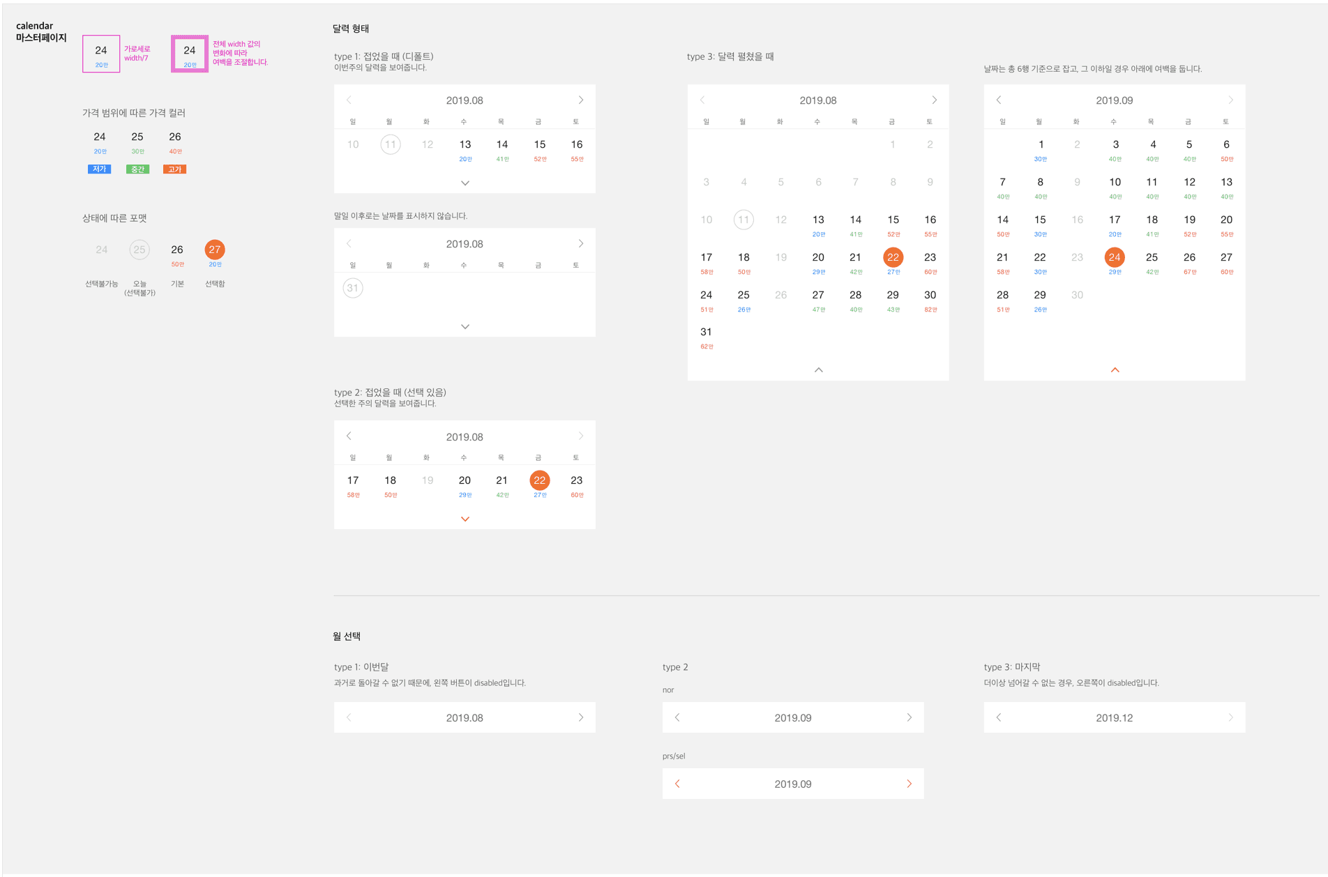
Design System
Detailed UI Guideline
Final Prototype

Before & After
Result & Impact
14.8%
Drop-off rate on the product detail page decreased after update (within 3 months)
25%
Reduction in customer service inquiries related to date and price confirmation
Insights
A mobile product doesn’t always need to be short and minimal to be effective
Even if a layout looks long or complex at first glance, it should be used if it's easier to understand and more intuitive to use